Create a simple Web page with pure HTML and CSS - The Holy Grail
We will be using a few lines of HTML to create what we call a holy grail layout.
Which is basically one of the most famous HTML/CSS layouts for websites consisting of a :
- Header
- Left Navigation Bar
- Right Navigation Bar
- Main content
- Footer
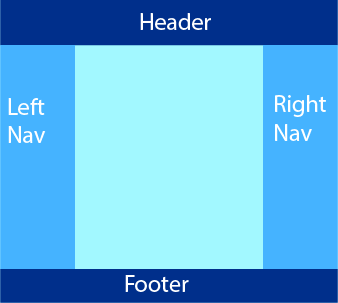
It would basically look something similar to this:
Let's take a look at the html code:
<head>
      <meta charset="utf-8">
      <title>Page Title</title>
      <link rel="stylesheet" href="css/CSSholyGrail.css">
</head>

<body>
<div class="container">

  <header>Header</header>
  <main>Main Content</main>
  <aside class="leftNav">LEFT SIDEBAR</aside>
  <aside class="rightNav">RIGHT SIDEBA</aside>
  <footer>Footer</footer>
  </div>

</body>
What we care about here is the contrainer which holds our main page parts we mentioned
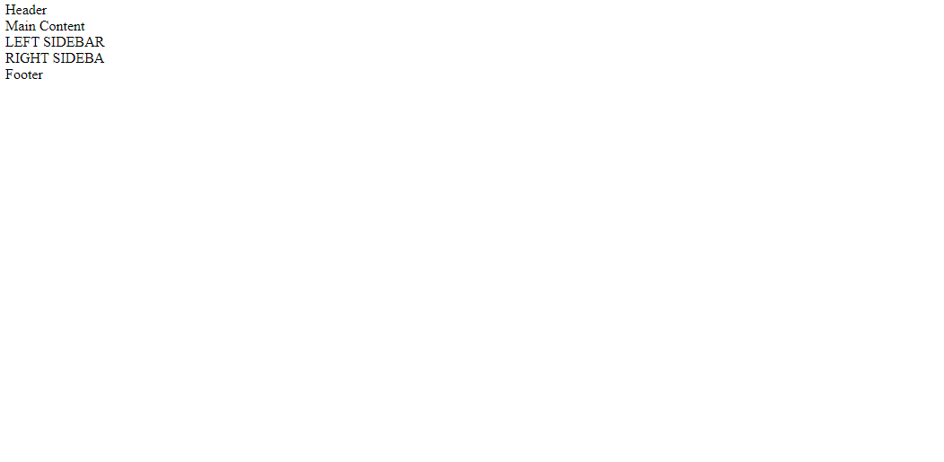
Once we add the HTML code, we would get a very simple lame page like the following:
The whole page processing will be done in CSS
Let's add some basic propeties and give each section a color:
*
{
  font-family: serif ;
  text-align:  center;
  padding: 0;
  margin: 0;
}

header
{
  background-color: red;
}

aside
{
  background-color: blue;
}

footer
{
  background-color: black;
}

body
{
  color: white;

}
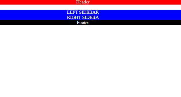
As we can see, every section now has a color, but it looks nothing like a sectioned website page.
Let's add flexbox properties to our CSS.
*
{
  font-family: serif ;
  text-align:  center;
  padding: 0;
  margin: 0;
}

header
{
  background-color: red;
}

aside
{
  background-color: blue;
}

footer
{
  background-color: black;
}

body
{
  color: white;

}

/*Flex-box section*/
.container {
  flex-direction: row;
  flex-wrap: wrap;}

header {
  width: 100%;
  order:0;}

main {
  flex: 5;
  order: 2;
  min-height: 99vh;}

.leftNav {
  order: 1;
  flex: 1;}

.rightNav {
  flex: 1;
  order: 3;
  width:500px;}

footer {
  width: 100%;
  order: 4;}
    }
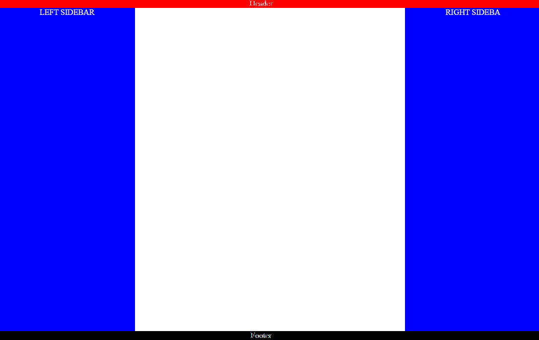
And the simple holy grail HTML/CSS would look something like this:
Let's brake down what each of these lines mean.
flex-direction: row
Meaning we would like to place our main elements one by one on one row. But will this eventually lead to putting all elements in a horizontal line extending to infinite? Not neccessarly if we use the wrap feature!
flex-wrap: wrap
It means that our flex horizontal direction will not extend to infinite, but will wrap to the next line when reaching the end of the screen
Header/Footer width:100%:
This will guarantee that the header and footer will extend in width, all the way to to the end of the screen.
order:
The best feature in flex-box ever, which will determine the order of the sections we have. In our case, we need header to be the first element, so we assign it to 0. Then we have our left nav, then our main, then our right nav, and finally the footer.
Flex:
If an element has flex: 1, this means the size of all of the other elements will have the same width as their content, but the element with flex: 1 will have the remaining full space given to it. Assigning flex to 5 for example, means that main will have 5 times the space combared to others.